
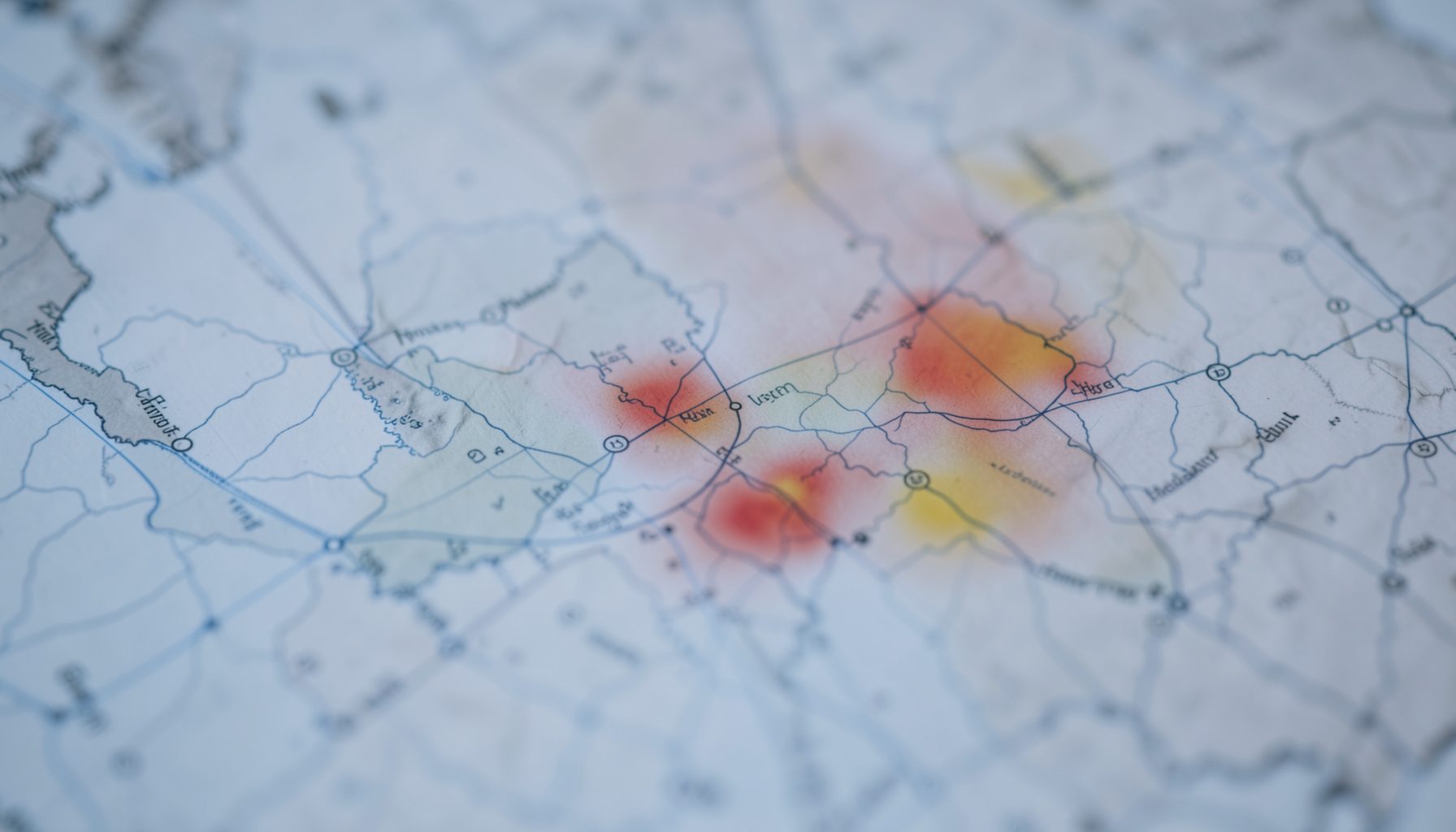
Nationwide Map-Based Visualization
The school absenteeism information collection system provided an interactive, map-based interface for visualizing absenteeism patterns across Japan. Users could view data at the prefectural level, with color-coded indicators highlighting areas where absenteeism exceeded normal thresholds. Clicking on a prefecture revealed detailed local information.
The visualization drew on data from approximately 23,618 schools across 25 prefectures, 6 designated cities, and 2 special wards — covering roughly 53% of elementary, junior high, and high schools nationwide as of January 2016. Nursery school data from about 8,631 facilities and roughly 800 certified childcare centers was also included.
Date-Range Filtering
The system allowed users to filter absenteeism data by year, month, and day. Available years included 2008, 2009, and 2010, with month selections from 1 through 12 and day selections from 1 through 31. After changing the date, users pressed an update button to refresh the map display.
Tracked Symptom Categories
The visualization tracked absenteeism across multiple symptom categories and closure types:
| Category | Description |
|---|---|
| Fever | Absenteeism due to elevated temperature |
| Headache | Absenteeism attributed to headache |
| Acute Respiratory Symptoms | Rapid-onset respiratory complaints |
| Diarrhea / Abdominal Pain | Gastrointestinal symptoms |
| Vomiting | Absenteeism with vomiting |
| Rash | Skin eruption-related absenteeism |
| Influenza-Like Illness | Symptoms consistent with influenza |
| Class Closure | Whole-class closure due to illness |
| Grade Closure (Influenza) | Grade-level closure for influenza |
| Grade Closure (Infectious Gastroenteritis) | Grade-level closure for gastroenteritis |
| Grade Closure (Other) | Grade-level closure for other causes |
Color-Coded Indicators
The map used a graduated color scale to indicate the severity of absenteeism at a glance:
- 0 — No abnormal absenteeism detected
- 1 — Slightly elevated
- 2 — Moderately elevated
- 3 — Significantly elevated
- 4 — High level
- 5+ — Very high / outbreak-level
- Not yet implemented / Not disclosed
The last data aggregation timestamp was displayed alongside the map, helping users confirm the recency of the information shown.
Related Resources
For more information about the school absenteeism surveillance system — including its history, implementation status, security measures, and demo access — visit the School Absenteeism page. Technical support inquiries can be directed to the Contact page.
The map-based visualization system served as a central tool for public health monitoring, transforming raw attendance data into actionable intelligence for officials at multiple levels of government. By presenting absenteeism trends geographically, the interface allowed users to quickly grasp regional variations and identify emerging patterns that might otherwise remain buried in spreadsheets or static reports. This approach reflected a broader shift toward data-driven decision-making in public health surveillance, where timely and visually accessible information can make the difference between early intervention and delayed response.
The color-coded indicators used in the system were carefully calibrated to distinguish normal fluctuations in attendance from statistically significant deviations. Threshold-based alerting helped public health authorities prioritize their attention, focusing resources on areas showing the most pronounced patterns. This prioritization was essential given the scale of the data involved, as monitoring thousands of schools across a large geographic area requires automated systems that can surface anomalies efficiently while reducing the risk of alert fatigue among users.
Beyond its immediate utility for absenteeism tracking, the platform demonstrated how syndromic surveillance principles could be adapted to non-clinical data sources. School attendance records, like other indirect indicators of community health, offer a passive and cost-effective complement to traditional disease reporting mechanisms. Because such data are already collected routinely for administrative purposes, they can be leveraged without imposing additional reporting burdens on schools or healthcare providers, making them an attractive component of a comprehensive early-warning framework.
The collaborative nature of the project highlighted the importance of partnerships between education and public health sectors. Feeding attendance information into a centralized surveillance platform required coordination across numerous school districts, each with its own data management practices and privacy considerations. Establishing clear protocols for data sharing, aggregation, and de-identification was critical to building trust among participating institutions and ensuring the long-term sustainability of the monitoring effort.
Interactive geographic tools of this kind also serve an important communication function, making complex public health information accessible to non-specialist audiences. When stakeholders can see at a glance where absenteeism is rising and how it compares to historical baselines, they are better equipped to participate in discussions about resource allocation and response planning. The same visualizations that inform expert analysis can be repurposed for briefings with policymakers, school administrators, and community leaders, amplifying the reach and impact of the underlying surveillance data.