





Reading Syndromic Trend Charts for Local Public Health Action
Syndromic surveillance charts help local public health teams detect unusual illness activity before diagnostic testing is complete. Rather than waiting for confirmed case counts, teams can examine symptoms, healthcare visits, ambulance calls, medication purchases, school absences, and other near-real-time indicators. The value lies in recognizing a meaningful change early enough to investigate and respond.
A trend chart is therefore more than a line moving upward or downward. It is a compact representation of time, place, population, reporting behavior, and data quality. Correct interpretation requires attention to the baseline, the size and duration of a deviation, the population covered, and the relationship between several information sources.
Japan’s multi-channel approach illustrates this principle. Information from clinics, hospitals, pharmacies, schools, elderly-care facilities, emergency transport, and laboratories can provide different views of the same community health event. A local team can use these views to distinguish a genuine public health signal from a reporting artifact or a short-lived fluctuation.
Start with the question behind the chart
Before interpreting a line, identify what the chart is designed to measure. A chart may show the number of consultations, the percentage of reporting facilities observing a symptom, ambulance dispatches, medicine sales, or absenteeism among students. These measures are related, but they do not represent the same stage of illness or the same population.
The time unit also matters. Daily data can reveal sudden changes but may be affected by weekends, holidays, delayed reporting, or a single large facility. Weekly aggregation often produces a clearer epidemiological pattern, although it can conceal a rapid increase that deserves immediate attention. Check whether the latest period is complete and whether recent values are provisional.
Define the geographic area and denominator before drawing conclusions. A rise in emergency calls across a large city has a different meaning from a rise in symptom reports at two clinics. Rates per 1,000 people, percentages, and raw counts should not be compared without understanding their underlying populations.
A useful first question is: “What decision could this chart inform?” If the purpose is to identify a possible respiratory outbreak, focus on respiratory symptoms and relevant age groups. If the purpose is to detect pressure on emergency services, prioritize ambulance and hospital indicators. The intended use determines which changes deserve attention.
Read the baseline before the latest point
The baseline is the expected pattern against which current activity is judged. It may be calculated from previous years, recent weeks, a moving average, or a modeled seasonal threshold. Without a baseline, a high value can be mistaken for an outbreak simply because it is common during winter, while a moderate value in an unusual season may be overlooked.
Look for recurring patterns such as weekday effects, school terms, public holidays, weather-related changes, and annual disease seasons. School absenteeism, for example, may rise during examinations, severe weather, or transportation disruption for reasons unrelated to infection. Resources on school absenteeism data can help teams place attendance signals within their proper context.
The shape of the deviation is often more informative than a single high point. A sustained rise across several reporting periods is generally more concerning than one isolated spike. A sharp increase followed by an immediate return to baseline may indicate delayed reporting, a local event, a coding change, or random variation.
Pay attention to the distance from the expected range, but do not treat a threshold as an automatic outbreak declaration. Thresholds are screening tools. They indicate that the pattern deserves review, not that transmission has been proven. Confirmation requires additional epidemiological investigation and, where appropriate, laboratory testing.
Judge the signal’s strength and reliability
Signal strength depends on magnitude, persistence, consistency, and coverage. A 20 percent increase may be important in a stable, high-volume dataset, while a 200 percent increase from five reports to fifteen may be statistically unstable. Always examine the numerator, denominator, and number of participating facilities where those details are available.
Data completeness should be considered alongside the trend. A falling line can reflect fewer submissions rather than fewer illnesses. Recent reporting periods may be incomplete because laboratories, pharmacies, or clinical sites submit information at different speeds. A dashboard should ideally mark preliminary values, revisions, missing records, and changes in participation.
Statistical variation is unavoidable in surveillance. Small communities and narrow syndromes produce noisier charts than large populations and broad symptom categories. Moving averages or rolling medians can make the underlying direction easier to see, but smoothing can delay recognition of a sudden event. Use the raw series and the smoothed series together when possible.
The most credible warning usually appears in more than one channel. A rise in fever-related clinic visits accompanied by increased pharmacy purchases and school absences is more persuasive than a rise in one source alone. However, the channels may not move at the same time. Pharmacies may show behavior before consultations, while laboratory confirmation can lag behind both.
Compare channels without treating them as interchangeable
Each surveillance stream captures a different part of the care-seeking and reporting pathway. Clinics may identify people with mild or moderate symptoms. Hospitals may reflect more severe disease. Ambulance data can indicate acute deterioration, but they may also be influenced by access, public awareness, or changes in dispatch practice. Pharmacy data can reveal treatment demand, though purchases are not equivalent to diagnosed infections.
The following comparison helps teams interpret what a change may mean:
| Surveillance channel | Population or event observed | Typical strength | Common interpretation risk |
|---|---|---|---|
| Clinics and hospitals | People seeking medical care | Direct view of healthcare demand and symptoms | Access changes or coding practices can alter the trend |
| Ambulance services | Emergency calls and transports | Useful for severe or rapidly developing illness | Dispatch policy and public behavior may influence counts |
| Pharmacies | Medication purchases or prescriptions | Can provide an early behavioral signal | Products may be used for several conditions |
| Schools | Absences, closures, or symptom clusters | Sensitive to transmission among children | Holidays, exams, and weather can create false signals |
| Elderly-care facilities | Symptoms or outbreaks in high-risk residents | Important for severe disease prevention | Small populations can produce large percentage changes |
| Laboratories | Tests and confirmed pathogens | Supports etiological interpretation | Turnaround time and testing availability create delays |
Cross-channel comparison should focus on direction, timing, and plausible relationships rather than exact numerical agreement. If school absences rise first, clinics rise later, and laboratory confirmations follow, the sequence may fit an emerging outbreak. If only pharmacy purchases increase while all clinical indicators remain stable, investigate medication availability, public messaging, or a seasonal self-care pattern.
The syndromic surveillance system provides wider context for understanding how multiple sources support early warning. For local teams, the practical lesson is to combine complementary indicators while preserving the limitations of each source.
Investigate geography, age, and setting
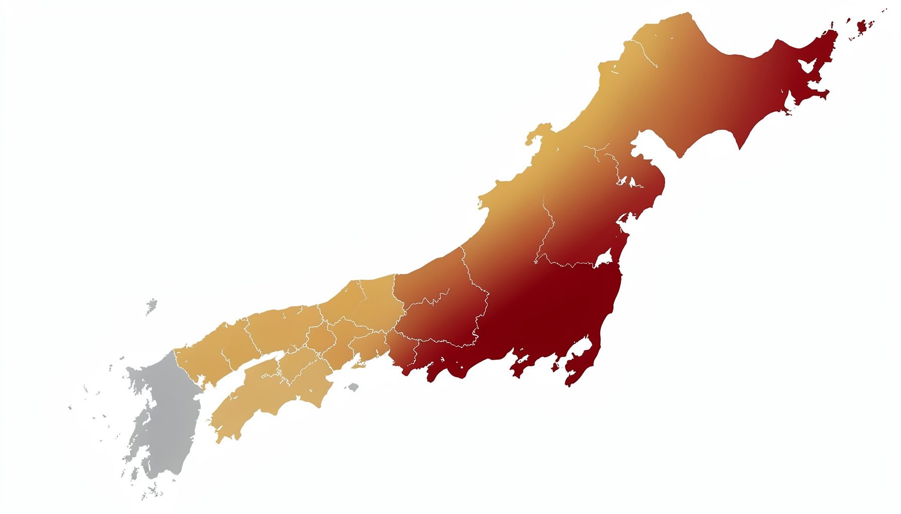
An overall regional trend can hide important local variation. A citywide increase may be concentrated in one neighborhood, school district, hospital catchment area, workplace, or residential facility. Mapping or stratifying the chart by municipality, age group, setting, or facility type can reveal where the signal begins and which populations are most affected.
Age patterns help distinguish possible transmission pathways and severity. An increase among school-aged children may appear first through absenteeism, while a later rise among older adults may indicate spread into higher-risk settings. A rise limited to one age group can also reflect changes in testing, vaccination, school schedules, or healthcare-seeking behavior.
Geographic comparisons require care when population sizes differ. A small district can have a high rate from a modest number of events, while a large district can have many cases but a lower rate. Use both counts and population-adjusted measures, and state clearly which one is being used.
Facility-level patterns may identify operational problems as well as disease activity. Several reports from one clinic could reflect a cluster, but they could also follow a new triage protocol or an unusually active reporting staff member. Contacting the reporting site is often necessary before escalating a signal.
Move from an alert to an investigation
A chart should trigger a proportionate workflow rather than an automatic public announcement. First verify the data: check completeness, reporting delays, duplicate records, changes in definitions, and unusual contributions from individual facilities. Then compare the signal with other channels and review recent local events, environmental conditions, and healthcare operations.
Next, define the smallest useful investigation. This may involve contacting a school, reviewing symptom descriptions, asking clinics about patient characteristics, checking ambulance narratives, or examining laboratory submissions. The objective is to test a plausible explanation quickly, not to collect every possible detail before acting.
A short internal record makes the reasoning transparent. Capture the observed change, the baseline used, the affected population, the confidence level, the possible explanations, and the action taken. Record when the chart will be reviewed again. This prevents teams from losing the context of a signal after it returns to normal.
Actions that improve chart interpretation
- Establish routine checks for data completeness, reporting delays, and sudden changes in facility participation.
- Review trends by age, location, syndrome, and care setting instead of relying only on the regional aggregate.
- Compare at least two complementary surveillance channels before assigning a likely explanation.
- Set escalation criteria that combine magnitude, persistence, geographic concentration, and potential severity.
- Document the baseline, uncertainty, investigation steps, and follow-up date for every notable alert.
Communicate uncertainty with precision
Public health communication should separate what the chart shows from what the team believes it may mean. “Respiratory consultations increased above the seasonal range for two consecutive weeks” is a direct observation. “The increase may reflect community transmission” is an interpretation. “An outbreak has been confirmed” is a much stronger statement that requires supporting evidence.
Use clear descriptions of timing and scope. Specify whether the signal is local or widespread, whether it affects one age group or several, and whether it appears in clinical, community, or laboratory data. Avoid presenting a preliminary value as final, especially when reporting delays are common.
Visual design also affects interpretation. Label axes and units, identify provisional periods, show the expected range, and use consistent scales when comparing regions. A chart with an exaggerated vertical axis can make a minor variation appear dramatic, while an overly broad scale can hide a meaningful rise.
When sharing information with decision-makers, connect the signal to an operational implication. A rise in severe respiratory indicators may require preparedness in hospitals and elderly-care facilities. A localized school cluster may call for targeted communication and enhanced monitoring. The response should match the evidence, the affected population, and the potential consequences.
Build a repeatable local review cycle
Reliable interpretation improves when chart review is part of a regular routine rather than an activity reserved for crises. Assign responsibility for checking dashboards, validating unusual values, contacting reporting sites, and briefing relevant agencies. A defined process reduces delays and prevents important signals from depending on one person’s availability.
Review the performance of the surveillance system after significant events. Ask whether the signal appeared early enough, which channel was most informative, where reporting was incomplete, and whether the response threshold was practical. These lessons can improve definitions, data-sharing agreements, visualization, and training.
Local teams should also maintain awareness of changes outside the chart. New clinical guidance, altered testing access, medication shortages, school calendars, public concern, and media coverage can all influence observed activity. Trend interpretation is strongest when quantitative surveillance is combined with operational and community context.
Use the data-use guidance to support responsible handling of surveillance information, especially when datasets involve sensitive locations, facilities, or population groups. Protect confidentiality, limit unnecessary detail, and ensure that early-warning data are used to support public health action rather than stigmatize communities.
Start the next review by selecting one current chart, stating its baseline and data limitations, and comparing it with at least one related channel. Record what changed, what remains uncertain, and which verification step will be completed next. That disciplined sequence turns a visual anomaly into a defensible public health decision.